Tuesday, March 22, 2011

Color Echo: Hue and Saturation

"Colors of infinite variety can be created by altering the effects of three variables: hue, saturation, and value" - Krause (209).

The purpose of this activity was to "create a word/image composition that features blocks of color in its border and/or backdrop" (219). The different techniques used in the in class activities vary from changing saturation, hue and lightness to posterization and magnetic lasso tool.

Below is the original image taken from Google.com

Below is the original image after +126 Hue: 

As you can see the colors have changed from the original apple image. 

Below is the original image after -60 saturation: 
Each version of the apple is changing. This version looks like the color has been somewhat stripped.

Below is the original image after -42 value/lightness:


Exercise 2:


The next exercise's purpose was to use color echo. I took an image of a coffee cup and uploaded it into photoshop. The next design techniques demonstrated will explain how my work has evolved. The first step was to magnetic lasso the coffee cup to eliminate the background. After that I opened a new file. I made a layer and then used the paint bucket tool on the other file to successfully get the same exact color dark blue that is located on the coffee cup and plate. After the background was successfully made the right color blue I dragged the coffee cup image to the newer file and moved the coffee cup to a section on the layer that looked eye pleasing. After that I used the free transform tool to make the coffee cup smaller. Following that, I used the rectangle tool to create a block at the top of the layer. I used the paint bucket tool again to find the exact color red to make the block at the top of the layer. I then used the type tool to create "Got Love?" and used the paint bucket tool once more to get the right color tannish/brown as the font color from a spot on the coffee cup. To add final effects I added posterization to the image. I found this exercise entertaining and fun! I truly enjoyed playing around on photoshop and using different types of tools on this image.

Legibility and Text Safe Areas

According to our book it states, "Legibility, the ease with which a viewer can read a headline or passage of text, is a crucial consideration when it comes to choosing and using a type face" (242).

The purpose of this activity was to be able to successfully match fonts to image theme and colors. With the introduction of Spring 2011, I thought it appropriate to find an image that conveys the color green and flowers. Using photoshop I implemented a picture found from Google.com and created a dance party invitation. I used the horizontal text tool to create eye pleasing and easy to understand messages. The font color as well as the font choice provide for an excellent combined theme: uplifting, fresh and springlike. Spring is one of my favorite seasons, which made this assignment very enjoyable.


Second Life Prim

The purpose of this exercise was to build an object in Second Life. The design techniques that I used was a triangle from the varying shapes library. I used the build tool to create a shape. After choosing a triangle as my shape, I proceeded to rotate the object to see the different angles. Once finished rotating the triangle, I placed the object in my inventory and made the triangle a part of my Second Life's body. The previous statements also demonstrate how my work has evolved from one version to the next. I think that because I have attached the shape to the body that it makes for an interesting view because the image is outside of normal societal rules. Although I like the image, I personally did not enjoy working with Second Life.

Thursday, February 24, 2011

Creating Icons


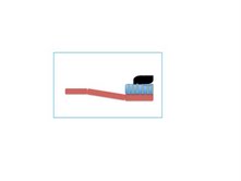
The purpose of this exercise was to find a simple object and create it into an icon. I chose to use a toothbrush as my icon because it is a necessary object that we use daily. The top image is the original photo that I based my newly created icon off of. The bottom image is the actual icon. I used a combination of different shapes to create a toothbrush. The backbone of the toothbrush was made from the square shape and simply arranged to look like the handle. The brushes of the toothbrush were made from another square with additional vertical lines colored in with green to add affect. Lastly, I used two tear drop shapes and rotated them so that it looks like one big shape and colored both in with black to eliminate any lines showing. I used the color black to make the image appear different from the original, however, now I think the image could look better if the background of the total icon was a darker color so that I could make the toothpaste a white or a blue. It was difficult for me to find a "simple object", but once I found the toothbrush, I enjoyed creating a new type of icon. I like my icon because it shows what a toothbrush is: simple.

Gestalt Principle - Closure

I principle I chose to practice with in class was closure. The purpose of this exercise was to explore different methods of Gestalt principles. I used two different shapes, circles and a square. The square represents the openness of the image, while the circles create the feeling of closure. The two shapes are opposing to each other. This image gives the allusion that there is a square in the middle, instead there are four shapes that close in.

Wednesday, February 23, 2011

Critical Reflection Section 1

1. Connection

The elements on my blog are thematically connected in association with all images. The images presented on my blog show clear associations because of the top labeling of each section. For example, I have sections labeled as the golden section, horizon adjustments, color and emphasis, alignment, etc. In each section there are appropriately matched images that represent the heading. There are also clear associations through the descriptions of my work. I thoroughly explain each exercise and the purpose of the images created. In doing that a blog viewer can clearly identify themes. I believe I have adequately made relevant connections between elements in the sense that each post is a new exercise. The images are all related because the starting point of the exercise is always to change an original visual. The most adequate example of connection was the grouping and theme activity, which allowed for creative ways to represent words with only images on a PowerPoint slide. The piece is not scattered because there is a clear topical order of what aspects of creating new visuals were introduced. Between each blog post there is already a visual break, which demonstrates a new subject. I believe that in this sense there should still be a visual break to show viewers change. However, within each post I do not believe there should be visual breaks because an interruption of flow may disengage a viewer from the images I have created. This blog is very structural because of the previously stated headings. The headings make for an easy way of finding different subjects and areas of making visuals.

2. Alignment

In executing the alignment we used one exercise. The most useful exercise was to create an advertisement for something of your interest. I am currently operating a student-run website called CampusCrush101.com, which gives dating advice and information. I decided to create an eye pleasing ad for CampusCrush101.com by using the solidarity method. The solidarity method involves two alignments, vertical and horizontal. None of the images are centered in order to put emphasis on the upper left corner and the bottom right. The placement of each image was carefully thought through in order to maintain organization. I have made sure that both the horizontal and vertical alignment are even and straight. As stated earlier, the conventions of alignment are constantly following throughout my piece because you can see the clear opposition of the images (upper left and bottom right). If my image were presented using a different organization, perhaps centered in the middle, I believe that viewers would lose interest. There are no exceptions that could be allowed to enforce this message. In order to generate interest there must be clear cut alignments. I believe that the way I have designed this ad, there is no trapped space that could be eliminated because there needs to be some open space in order to emphasis the shapes on the image.

3. Priority

Overall, I am pleased with my work completed in the Composition Section. I believe my work looks organized and well-placed. There is a clear and appropriate hierarchy between elements because of the exercises done in class. The common direction of exercises is to alter an image. I believe that most of my alterations look better than the original image. For example, the horizon in class exercise allowed me to emphasize the horizon more thoroughly than the original photographer. In the grouping and theme in class exercise, perhaps I could have made the shapes larger to make for a better visual effect. In the color and emphasis in class exercise, I believe I successfully executed a good balance of color and value to the "street scene". Making the image black and white and then bringing out the individuality of the red dress creates a stronger message than the original and makes for an improved design layout. The color red holds the most dominance in the picture, which presents a hierarchy to other aspects of the image, for example the table or the store in the background. The flow of each exercise is vertical and the sense of visual flow is easy to follow as you can continue reading about the construction of each one of my images by reading in the same direction. My blog is very organized and does not make the eye feel pulled in opposing directions. The headings of the blogs provide for transitions and topic changes, which actually grabs the eye's attention even more.

Tuesday, February 22, 2011

Color and Emphasis

The purpose of today's in class exercise was to learn new skills in color and emphasis. According to our book, Design Basics Index, by Jim Krause it states, "Color is an extremely effective tool when it comes to making one element stand out above others. But, just as with other forms of emphasis, its effect depends on how it is used in relation to its surroundings" (74). Using color creates value in images to bring notice to a certain aspect.

As the warm-up exercise, we used an image from the web. I chose to use a puppy because I find them to be very cute. Below is the original image of the puppy:


The following image is my first exercise using the puppy as my image: 


The purpose of this image was to present one shape as more valuable or distinct from the other existing shapes. First I used the magnetic lasso tool to outline the shape of the puppy from the original image. Then I used the select inverse tool in order to delete the background. After that I opened a new window and dragged the puppy shape onto it. From that point I created four different layers, each layer with one puppy on it. Each time I moved the puppy shape to the image, I used the "free transverse" tool to resize the shape. Then, I selected the second layer, with the middle puppy and used the selective coloring tool to make the middle puppy red. Finally, I inserted some opacity in order to identify the shape as a puppy. This image has drastically changed from the original image because there is no grass background and there are now three smaller shaped puppies rather than one large one. There is also a new color scheme. I enjoyed making this because everyone loves an image of a cute puppy like this one. 

The next exercise we completed in class was to combine a feeling of an old picture and a modern picture. To do this we were asked to find a picture of a street and make it black and white. Then we were asked to make one aspect of the image a color. 


The following is the original image I used: 


This image was taken in Paris, France. 

Below is my version of the photo: 


The purpose of this image represents past and present. The beginning creations of this image was quite difficult for me, however, I explored the different tools I could use and finally discovered an effective and easy way to use color and emphasis. To create this image I first used the magnetic lasso tool around the woman's dress. I then used the select inverse tool, but did not delete the background, instead used the adjustment tool to turn everything but the red dress black and white. This image has changed from the original because now the red stands out more than in the colored version. The red dress holds more emphasis and dominance. The black and white also makes the image seem more seductive, which could send a different message from the original image. I believe that my edited version actually looks better than the original because the one color makes it pop more. 

I had a lot of fun doing both of these exercises and now want to continue more with some of my own personal photos!