According to our book it states, "Type can be used to impart playful conveyances of its own either alongside or apart from the actual meaning(s) of the words being presented. Treatments such as these can raise the level of visual interest within headline, logo or featured typographic element" (296).
The purpose of this exercise was to use these six words, shred, lightly, atom, brick, pillow and XXL and portray each with a font and theme that fits the word. Throughout each of these designs I used the software Photoshop. I used various custom shapes and tools to change and evolve each image. I believe the quality of all these images exhibit creativity and careful thought.
Below are the images created for each word:
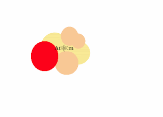
This word is atom. The tools I used include: the circle shape, custom shapes to make the "o" in the atom look like an actual atom. I used the paint bucket to differentiate the circles.
This word was brick. I immediately through of a brick wall and then continued to look through the font types and found the font in the image. It is very square and brick like, blunt and simple. Much like a brick. I like the added effect that I gave to make it look like a brick wall.
This word is lightly. Tools I used include the font tool, all capitalizations, the paint bucket to make the background yellow and finally the opacity tool to make the word lightly physically look light on the yellow background.
This word was pillow. This word was the most difficult for me to create and I am still not fully satisfied with it, whoever I find that it does provide for a creative aspect. I think that it looks like one of my body pillows at home. It's long and pink and can be molded to your body. I made the font have the same theme in which it is molding to the pillow's shape.
This word is shred. I had the most fun creating this word because I was able to use a different texture, which you can clearly see looks like a shredded screen. I think that the word shred is very bold so I decided to use the color red.
This word is XXL. I also enjoyed creating this image as well because it looks clean and something that Andy Warhol would use in one of his exhibits. I decided to make the font and letters extremely large because that captures the essence of the word. I believe that the effect of making some parts of the letters seem like they never adds to different perceptions.


Your images are really fun! I really like the use of different textures within each piece, it makes them pop of the page. I really like your 'atom' image, the font size is really appropriate for what it is. The same thing goes for 'xxl'. For your 'shred' image, the red is a good contrast to the background and provides the legibility that we read about. I think that these images are really good!
ReplyDelete-Lamar