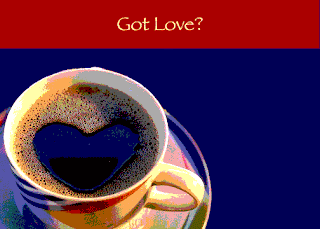
The purpose of this activity was to "create a word/image composition that features blocks of color in its border and/or backdrop" (219). The different techniques used in the in class activities vary from changing saturation, hue and lightness to posterization and magnetic lasso tool.
Below is the original image taken from Google.com
Below is the original image after +126 Hue:
Below is the original image after -60 saturation:
Each version of the apple is changing. This version looks like the color has been somewhat stripped.
Below is the original image after -42 value/lightness:
Exercise 2:
 The next exercise's purpose was to use color echo. I took an image of a coffee cup and uploaded it into photoshop. The next design techniques demonstrated will explain how my work has evolved. The first step was to magnetic lasso the coffee cup to eliminate the background. After that I opened a new file. I made a layer and then used the paint bucket tool on the other file to successfully get the same exact color dark blue that is located on the coffee cup and plate. After the background was successfully made the right color blue I dragged the coffee cup image to the newer file and moved the coffee cup to a section on the layer that looked eye pleasing. After that I used the free transform tool to make the coffee cup smaller. Following that, I used the rectangle tool to create a block at the top of the layer. I used the paint bucket tool again to find the exact color red to make the block at the top of the layer. I then used the type tool to create "Got Love?" and used the paint bucket tool once more to get the right color tannish/brown as the font color from a spot on the coffee cup. To add final effects I added posterization to the image. I found this exercise entertaining and fun! I truly enjoyed playing around on photoshop and using different types of tools on this image.


